
The solution an effective onboarding for the compit app was essential to give our users some hand-holding, allowing them to complete their objective which is the main reason why they even use the product.
View site
My Role
I lead and planned all the product designs for multiple responsive platforms, I worked closely with the startup owners and stakeholders to build an MVP.

As a real estate investor, I would like to find the best investment opportunities for me
About Compit
The Compit system specializes in the valuation of urban residential real estate markets. Compit meets an immense demand for accurately valuing, buying, and selling assets in the most prominent and complex global real estate markets.
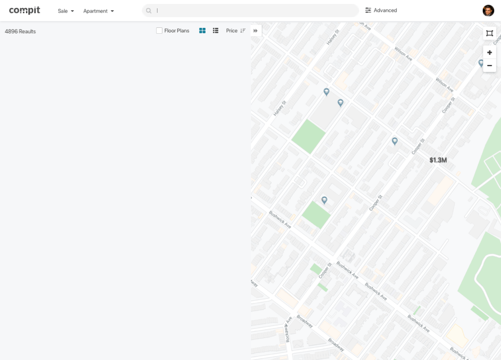
Web vs. the App
Finding a good investment takes lots of time and is a lot of hard work. when we came out with the Compit web tool, we received positive feedback from our users saying it was very clear and easy to use. On the contrary, the app wasn't doing too well on the first release. The number of users drop out over 70%...
Understanding the problem
I decided to analyze the first-time user flow of the app and see what we can learn and improve.
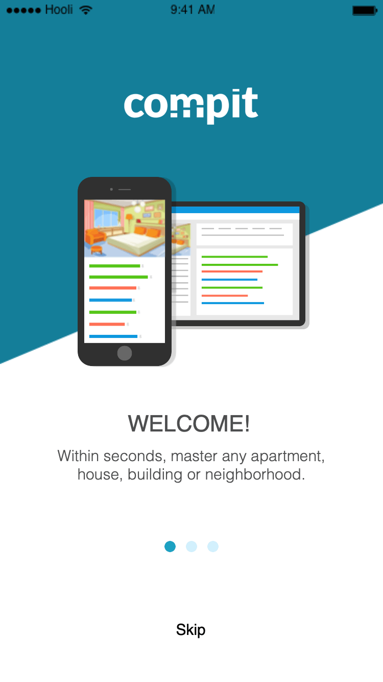
First time sign up flow and onboarding
The original onboarding I had designed was a series of slideshows with nice illustrations and some copy to explain the product. This is a common pattern for mobile applications, but the problem is that users normally can’t wait to use the product and its features.
Defining the problem
We quickly found that users would not read those onboarding cards! skip them and proceed to experience the product immediately. Those slideshows and explanatory screens did little to help the user in using our product — I would argue that a simple greetings card would suffice instead.


Pain points
-
Users skip the onboarding
-
Users don’t read the copy
-
Users get to the home screen and see non-relevant contact
-
User need to always filter and search
-
User need to self educate themselves on the home screen
Progressive onboarding
I suggested to my product manager that we break the current flow and try something different.
I brought up the idea that we should create a progressive onboarding that interacts with the user as they use your product. less invasive and doesn’t bombard your user with tons of unnecessary information which they don’t need. Guided task completion is a method for prompting users to interact with the product in a series of steps.
The goal
-
Learning about the user's interests
-
Get focus results on the homepage
-
Minimize filtering
-
Educating the user about the apps use
-
Early user interaction
-
Increase number of signups
User research and BI
What we see is that although 80% of users filter by location, 66% are looking for a property based on the price range and budget, and 57% filter by the number of bedrooms.
I then took those top 3 filters and started sketching a 3 step onboarding based on my learnings.

Desk Research
In addition, I researched filtering hierarchies related to other real estate sites and apps. The goal was to understand how competitors behave and benchmark filtering and user onboardings.

Learnings
I've found that the three top filters our competitors use were very identical to the top three most used filters in our system.

Wireframe
The Wireframe was designed to build the structure and architecture of the information and only then go to visual and interactions. The idea I had was to create a simple 3 step questionnaire asking based on the top three filters. the goal was to get use the information we got and customize the results on the home screen to match the user's interests.

Designs


View more projects


