
Houzz Sketch

Sketch is a function in the Houzz app that makes it even easier to communicate using photos and to add products on Houzz to any photo. With Sketch, you can select any of the photos on Houzz, or take one of your own, then add products on Houzz and annotate the photos using tools such as stickers for easy communication.
To date, the app has more than 50M+ downloads
Download the app
My Role
For this project, I conducted research, set goals and made the design decisions. I also created wireframes and prototypes while working closely with my PM and developers.

The following question was raised to our team:
How can users collaborate with friends or professionals and share ideas easily?
The need
I conducted a research effort to better understand what kind of messages users like to share, what kind of questions are commonly asked. I started by taking a closer look at user comments.

Findings
Houzz users have expressed a need to know details regarding the content of the photos. such as dimensions, colors, and ideas they would like to express visually. Currently, the only communication tool is by using the comments section.
The Solution
Create an interactive and intuitively easy to use system for users to express and share ideas on a photo using the app

Challenges
-
Simple as tap, drag and drop
-
Quick and self-educating to the user
-
Add value to existing behaviour
-
Clean look and feel that doesn't overcome the photos
-
Needs to work both on small and large devices i.e phones and tablets
Target Audience
Houzz users, Male & Female, age 30-60. Not tech savvy. in others, my mom.
Research and inspiration
I started my research by looking at experiencing exciting apps in the market. I researched a number of different apps to learn about the various features we were looking to implement into our solution. Such as drawing apps, measurement apps, photo editing apps, sticker apps and etc.

Findings
Each one of the apps I looked into is very different in terms of UX and behaviours. Also, there is not one app that has all the features I was looking for in one place that match our goals and needs. Most of these apps are pretty sophisticated, not intuitive and not user-friendly. I looked into other apps as well, for example, apps that have the option to place a sticker on a photo and app you can write and edit text. Though there is a lot to learn from and I will end up using this a good reference when putting each of the tools together.
Sketch tools
The next step was to decide what tools we would like to have in the sketch feature and work on each tool as a separate task. then put it all together to into one feature:
The tools:
-
Draw
-
Measure
-
Arrow
-
Text
-
Stickers
-
Products
I created a break down of the amenities of each tool. and added the actions, delete and undo:

Wireframes and Iterations
Key challenges when designing the sketch toolbar and behaviours

Creating wireframes was especially important for solving this space in that there was a lot of variables to consider, which paired well with the quick iterations that wireframes are good for.

I iterated the wireframe design by conducting informal usability testing with the low-fidelity prototype. At the same time, I asked my team to provide their sketches during the design sprint. This activity allows us to share our ideas and aligned them better in a technical aspect.
Initial UI design
The next step after the sketches faze, I got a better understanding of how the toolbar should behave and started testing a number of layouts for the bar. I found it to be more challenging finding a solution for small devices like phones due to the lack of real estate. even though we figured it will be easier for users to express their thoughts on larger devices I started with a design for the phone then moved to iPad. I figured if I nail it on the small devices first I can easily use the same solution on the large devices.


Back to the drawing board
I presented a number of designs to my team and the main feedback I got was that the designs were nice but caused a bit too much clutter on the small devices. They suggested I look for a neater L&F and a layout that has a unique style. so back to the sketches. after many tryouts,
I finally came up with the following design:


Designs in action!
Now we got a strong feeling this design can work on all platforms. it is simple. self-explanatory. and looks amazing!
I worked closely with my developers to get all the animations and timing right and to look slick and neat.
From the Sketch menu, select the pencil, you can draw directly on photos, it is super easy. whether to circle a design feature that inspires you or pick a color you liked using the color picker.


From the skecth menu select the measure tool, note the dimensions of a room, and start making notes! Select between ruler options and match the color you wish to use.
To express thoughts quickly, we created the stickers tool. Simply by tap the smiley face in the Sketch menu. With more than 150 stickers available, you can make notes of things you like and areas you’d like to change. You can also insert placeholders for products, materials and features you’d like to add to the space.


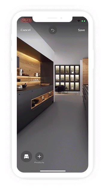
Products in sketch
The next step in the sketch project was adding a flow for placing products on a photo from within the products section of the app. The goal was to create an easy flow where users can find a product using search and filter, select the product, place it into sketch, and adjust the product in the photo by moving it around, resizing and duplicating according to the users' needs. This was another way to get users excited about a product. the main goal was to get the user to add the product to his cart and eventually make a purchase.
Wires and flows

Products in action
By selecting the chair icon in the Sketch menu, you can add any of the millions of products and materials from the Houzz Shop directly to the photo to explore design ideas.
In the media
View more projects


